REDESIGNING GOOGLE
A Brief History of the Complete Redesign of Google
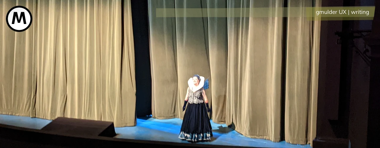
Evelyn Kim, visual designer for Google Maps, talks about her part in the History of the Complete Redesign of Google.
2007 saw Google’s first attempt at a global redesign of it’s diverse services, Evelyn Kim, visual designer for Google Maps, recalls in her part of the SXSW2012 panel A Brief History of the Complete Redesign of Google. It was codenamed Kanna.
Kanna
The thing about Kanna was, that hardly anybody else saw it. It was a very thorough undertaking, meticulously designed, based on brand analysis, and nicely done up as a projected presentation, complete with all the whys and hows that can be expected. It was codenamed kanna. It is icelandic, as a verb it means to explore, to investigate, and yes, it is ethymologically linked to “can”. But – they couldn’t. In the meeting, apparently, everybody nodded and that was that: it went nowhere.
Strawman
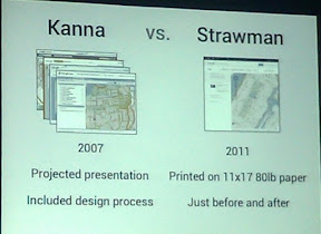 In 2011, the second attempt was launched, Codenamed Strawman. This time, Larry (Page) was presented printouts showing several screens representative of Google products as before and after redesign. In the meeting, they huddled around the printout, discussing, showing options, generally, as Kim called it, taking the design temperature – asking Larry for an opinion. And this didn’t go anywhere, it went off like a rocket. Larry, they recalled, told them he wanted to launch the redesign “this summer”. The meeting had been on April 1st – so after making sure that it was not a matter of april fools, the date send them first checking for the latest conceivable date that could still be considered “this summer“, and secondly working out the bits and bobs of the design.
Unlike the first effort, Strawman remained a strictly collaborative effort of true kanna. To begin with, the designers were embedded – working as designers within the product teams instead of outside them as part of a removed design departement. And secondly, as can be expected from Google, they worked their way towards the finish line with trial and error, working with static HTML prototypes, doing qualitative research – asking for emotional feedback based on screenshots, to quantitative research, trying out different colours on the live site, on a limited amount of users.
And finally, there came a time for eating your own dog food: rolling out the redesign – by now codenamed Kennedy – to the users within Google, to get some real feedback. Or, as it was generally called:
Gmailageddon
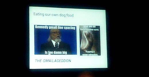
Big changes to much used products produce massive change aversion. Many contended points are, of course still valid: scaling and line spacing, for example, were and remain such points. 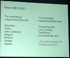 “When,” as Google-Mail Lead Designer Michael Legget pointed out, “you are a power user, it makes sense to cram things in, where others would want more room to breathe.” So they made sure in their commercial material that you knew how to switch back from the more relaxed line spacing to the crammed old style.
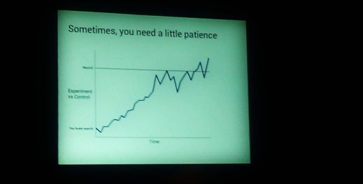
But they also learned that big changes need time: to see, if something is fundamentally wrong with what you are doing – or if people are just averse to change. Because sometimes….